In a previous post, we looked at how to build a dashboard for 15- and 30-year mortgage rates using JavaScript and Observable Plot. Now we want to add simple interaction to it, to let the user pick the year they’re looking at. The reactive nature of Observable Framework code and Observable Plot make this very easy.
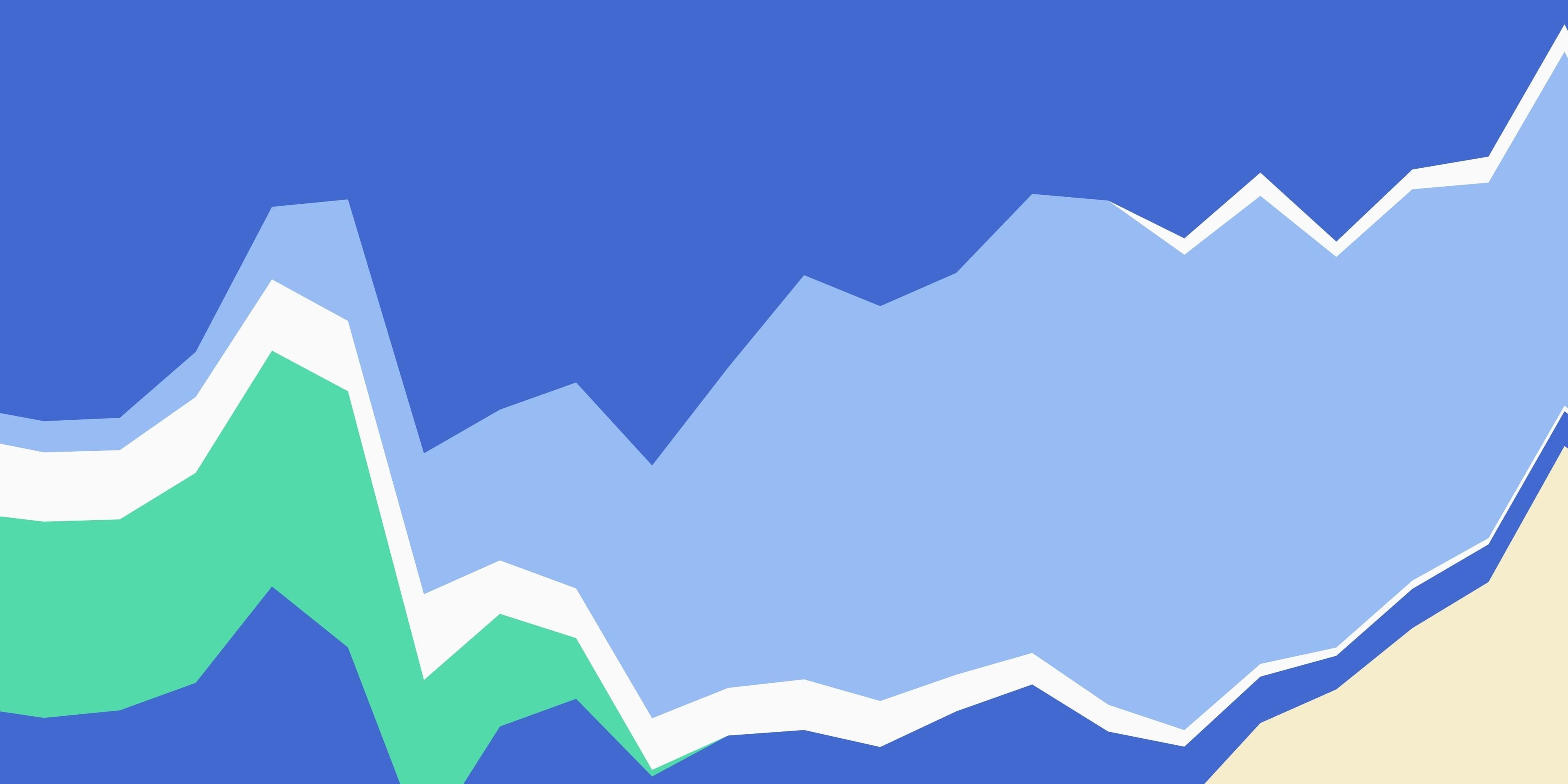
Here’s a preview of what we’re building (you can see it live here, code is available in our examples):
If you haven't yet read our previous blog post or seen the original dashboard, please take a look at those first. We covered the dashboard in great detail there, including what the data looks like, and the different charts and how they’re built.
First, we want to add a way to change the current year. For simplicity, we’ll use a slider, or range control, here. In code, it looks like this:
const selectedYear = view(Inputs.range(d3.extent(pmms, d => d.date.getFullYear()),
                           {label: 'Year:', step: 1, value: 2023}));
Which gives us this slider:

This works by defining a constant named selectedYear, which is assigned the result of the built-in view function. This function displays the input we’re passing into it, and returns the value that the user selects.
There's a lot there, so let's break down that line of code. First, you might be wondering about the const keyword here. The value of our constant will change when the user moves the range slider, which will re-run any parts of our code that depend on it. As long as the value of the input doesn’t change, however, this is really a constant.
The input is a range input, created by the Inputs.range() function from the Observable Inputs library (which is part of Framework’s standard library, so is available to use by default in the Markdown file). We need to tell it the range of values that a user can select from, which is done with this code fragment:
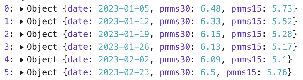
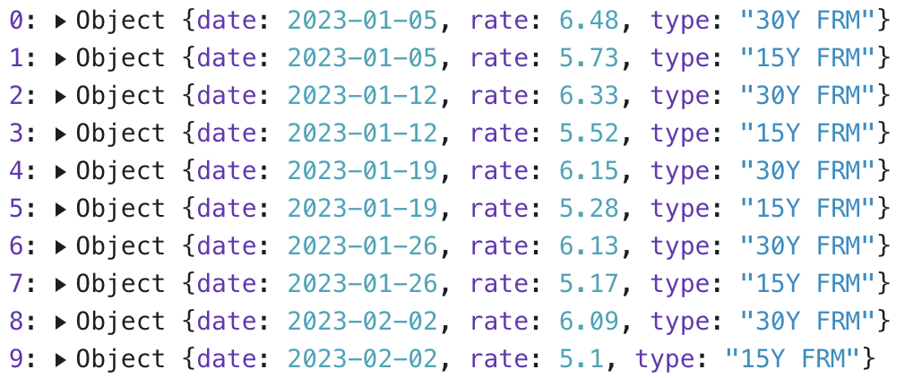
d3.extent(pmms, d => d.date.getFullYear())The extent() function computes the minimum and maximum values in an array and returns them as a two-value array. We pass in our pmms array, which contains mortgage rate values for both 15- and 30-year mortgages for each month (named for the Primary Mortgage Market Survey). It looks like this:
We’re only interested in the year of the date entry though, so we also supply an accessor function that gets the date value for each row and returns its four-digit year.
The second argument to Inputs.range() is an object with a few options:
{label: 'Year:', step: 1, value: 2023}We set the label we want to display in front of the slider, the step size (we only want whole years), and the starting value.
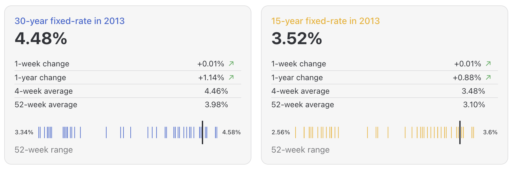
Now that we have a way of picking the year of interest, we can update our charts. First, let’s look at the tick charts. They were built to visualize 15- and 30-year mortgage rates over the most recent 52 weeks of data (see the previous post for details). Instead, we want to select the values for the relevant year and only plot those.
To do this, we filter the pmms array to give us only those values:
const pmmsSubset = pmms.filter(d => d.date.getFullYear() === selectedYear);The filter() function is built into JavaScript and returns only those values for which the supplied function returns true. Our anonymous function is similar to the one we used above: it accesses the entry’s date property, gets its four-digit year, and compares that to the year the user has selected in the range input.
We can now use pmmsSubset instead of pmms. This is straightforward in the Plot code, where we replace
Plot.tickX(pmms, {…with
Plot.tickX(pmmsSubset, {…Similarly, the text values on the left and right of the chart depend on a value called range, which was computed based on the previous 53 values.
const range = d3.extent(pmms.slice(-52), (d) => d[key]);By using our subset instead, we get the correct range for the selected year:
const range = d3.extent(pmmsSubset, (d) => d[key]);Finally, the heavier tick mark showing the last value in the chart gets updated similarly, from
Plot.tickX(pmms.slice(-1), {x: key, strokeWidth: 2}),to
Plot.tickX(pmmsSubset.slice(-1), {x: key, strokeWidth: 2}),Most of this is really just data management so the right values can be passed into the calls to Plot. Every time the user moves the slider, Framework’s reactivity automatically re-runs all the code depending on selectedYear (whether directly or indirectly), and the charts are recreated. In the next section, we’ll repeat this process for the line chart.
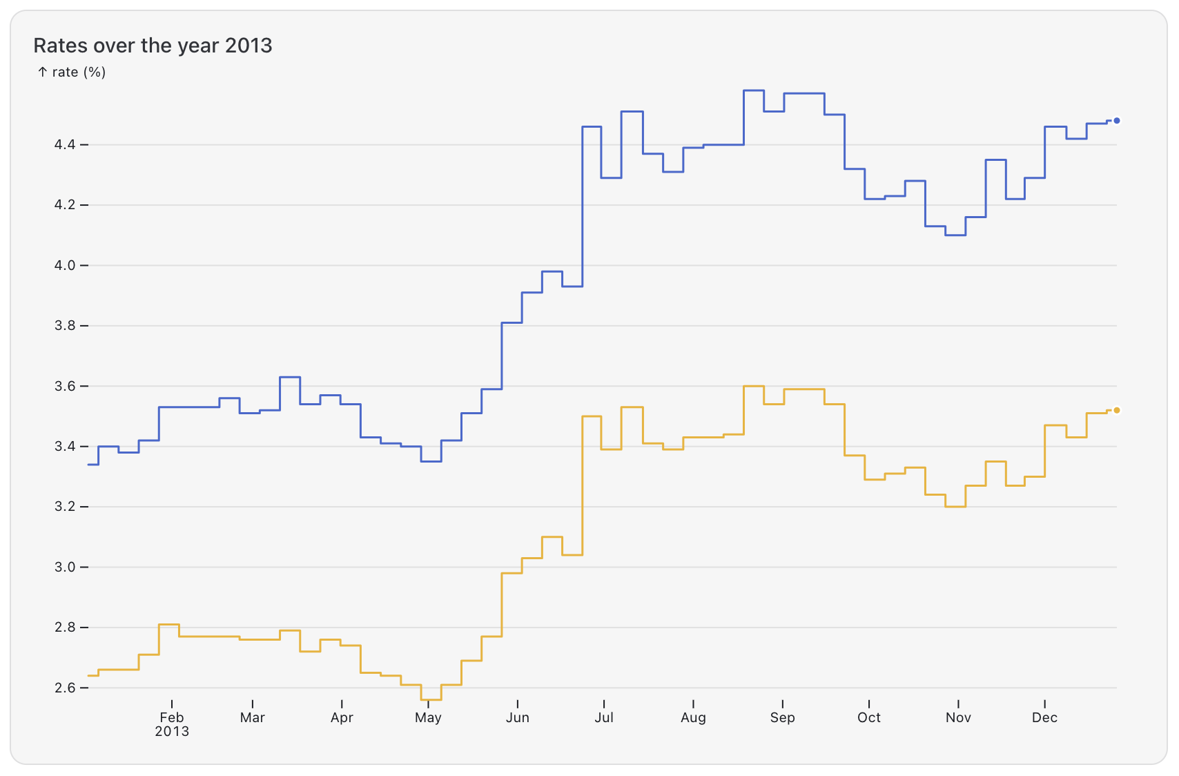
There's also a stepped line chart, which currently shows the development over the last year we have data for. We want to change it to show data for the year we selected, like this (showing mortgage rates for every week in 2013):
Similar to the tick charts, the stepped line chart used the slice() function to extract the last 53 data values. It is drawing from the tidy version of our dataset, called tidy, which has separate entries for the 15- and 30-year mortgage rates for each month. It looks like this:
In order to extract the 53 last values for both variables, the static version sliced off twice as many records from the end of the array:
tidy.slice(-53 * 2),Now to get just the values for the year we’re interested in, we can do essentially the same thing as above, but for the tidy variable. In this case, we’re not storing the result separately since we only need it once.
tidy.filter(d => d.date.getFullYear() === selectedYear)And voilà, we have a beautiful stepped line chart that shows just the year the user has selected!
The bottom line chart showing all the data doesn’t need to update at all, since it always shows the entire range. However, we want to be able to see what year was selected.
To do this, we’ll add a background rectangle that will highlight that year.
Plot.rectY([{year: selectedYear}],
    {x1: d => new Date(d.year, 0, 1), x2: d => new Date(d.year+1, 0),
     y1: 0, y2: d3.max(tidy, d => d.rate), fill: 'lightgray'}),
Let’s break down how this works. We’re adding a rectangle using the Plot.rectY() function. It needs data and a set of mappings. The data consists of an array with a single entry. We’re using an object for this, even though we could also just make an array of numbers (or, in this case, a single number).
[{year: selectedYear}]We then need four coordinates to specify the rectangle, x1, y1, x2, and y2. The coordinate system is the domain of the data, so we have to specify the x coordinates using dates and the y coordinates in terms of rate percent. For x1 and x2, that means creating new dates for the first day of the year we’re interested in, and the first day of the next year. The anonymous functions get the object passed to them that we just looked at above.
x1: d => new Date(d.year, 0, 1), x2: d => new Date(d.year+1, 0)The bottom y coordinate is 0, since we’re forcing the chart to include it using the horizontal line at zero. For the top, y2, we want to extend to the top of the chart. We do this by using the maximum value we can find in the tidy data array. The d3.max() function works similarly to d3.extent(), which we already used above, except it only returns the maximum.
y1: 0, y2: d3.max(tidy, d => d.rate)Finally, we specify the fill color to be slightly different from the background, so we can see the rectangle. If we make it the first entry in the marks array of the specification, it gets drawn first, so all the lines will appear on top of it.
The complete example code is available in our examples, or play with the live dashboard yourself here.
There is no reason a statically-generated dashboard has to be static! Using Observable Framework’s reactive nature and the flexibility of Plot, we can easily add simple interaction to it.
Interactivity lets users ask more questions and get more value out of a dashboard. Instead of picking the year, we could let the user specify an exact date range. The changes to our code would be fairly minimal. We could also make it possible to switch the different series on and off, in case somebody might not care about one or the other.
This particular dataset doesn’t have many columns or levels of granularity, but it is easy to imagine being able to pick a metro area or region, for example, instead of getting values for the entire U.S. Once you start adding interactivity, the possibilities are endless.