With Observable Framework, you can build dashboards entirely with code. But what does that look like? How does layout work, how do you prepare the data, how do you create the charts and make them interactive? In this series of blog posts, we’ll answer these questions and more.
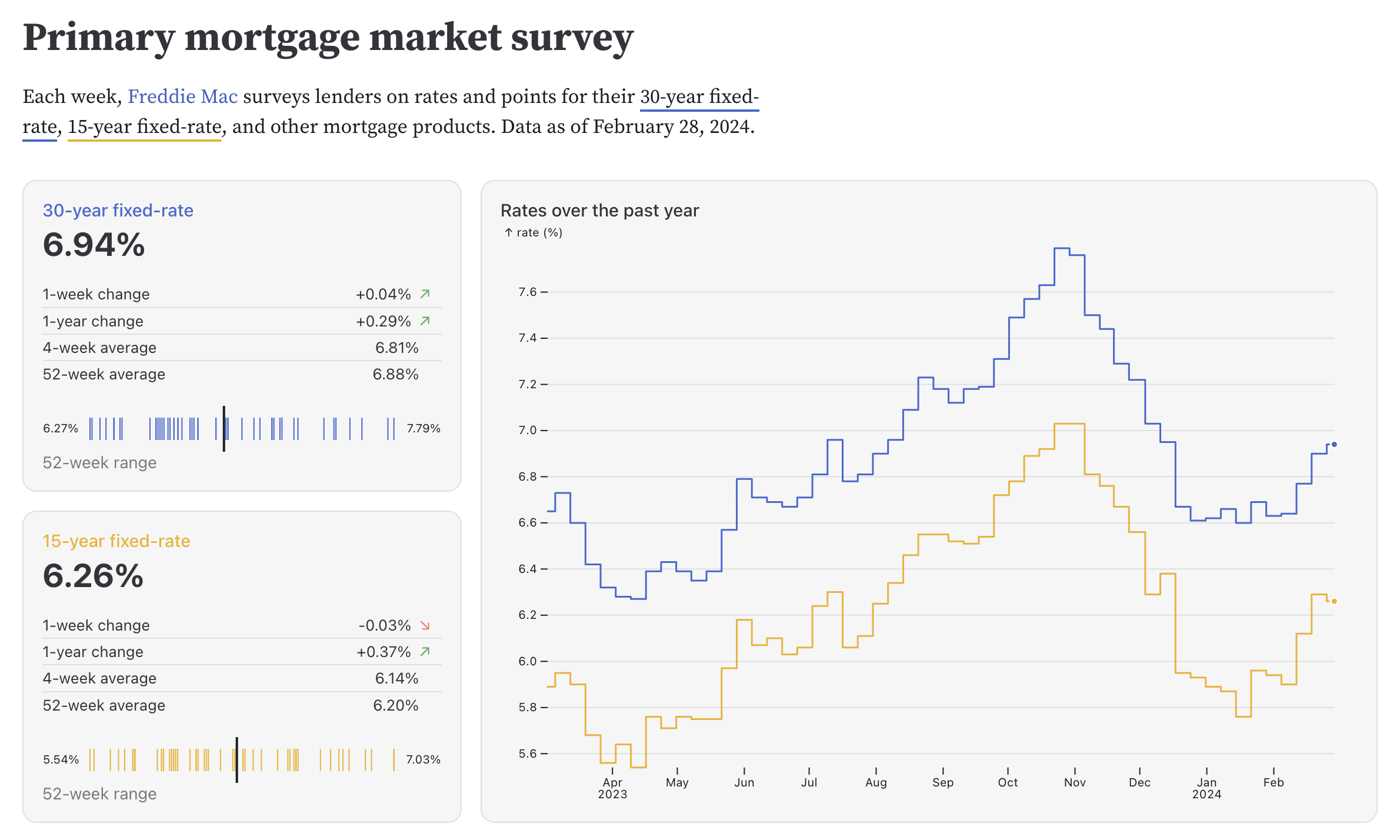
For our first post in the series, we’ll explore an example dashboard that displays weekly changes in interest rates for 30- and 15-year fixed-rate mortgages in the U.S. from 1971 to today. It contains two different types of line charts, as well as a density chart of tick marks. We’ll look at how each of them is built using Observable Plot, and briefly touch on how the layout code works. If you want to dive in directly, the source code is available here.
The data is loaded from an API that updates once a week. This is handled by a data loader written in TypeScript. Framework allows you to use a variety of languages to load and prepare data, which we’ll cover in more detail in a later blog post. The data loader is run as part of Observable Framework’s build process, and generates a CSV file. This file can be loaded into our dashboard much faster than accessing and querying the API on the client, allowing for almost instant page loads.
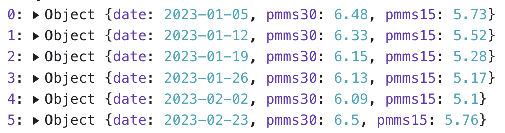
Since the data is coming from a CSV file, it is naturally in a simple tabular format. In JavaScript, this translates into an array of objects, with each having three keys: date, pmms30, and pmms15. PMMS stands for primary mortgage market survey — the original data source — for 30- and 15-year fixed-rate mortgages, respectively.
Values from early 2023 are shown below (pmms15 values before 1990 are missing, so they end up being represented as null values).
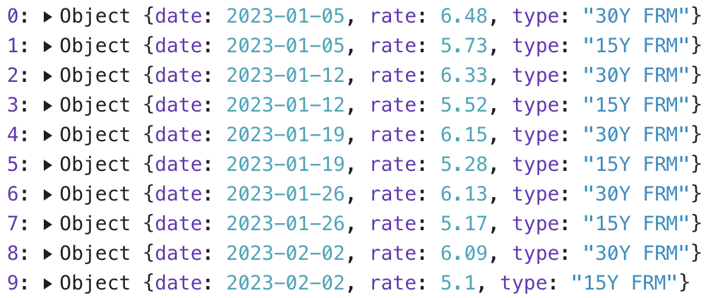
To create multiseries line charts in Plot (with lines for pmms30 and pmms15) more easily, we’ll transform the data into tidy format:
const tidy = pmms.flatMap(({date, pmms30, pmms15}) => [
  {date, rate: pmms30, type: "30Y FRM"},
  {date, rate: pmms15, type: "15Y FRM"}
])
The flatMap() function (which is similar to map()) creates two objects for each entry in the initial data. Instead of the date and the two mortgage rates, we now have a date, a rate, and the type: “30Y FRM” or “15Y FRM”. FlatMap allows us to emit an array of multiple values from our function and flattens them all into one.
The new, tidy version of the data looks like this:
The overall dashboard layout is created using CSS classes that are built into Framework. The grid CSS classes can be used to create a grid with up to four columns that resize with the browser window. Cards can span multiple rows and columns, as you can see here (this is slightly simplified from the actual code):
<div class="grid grid-cols-2-3">
   <div class="card">[30-year card]</div>
   <div class="card">[15-year card]</div>
   <div class="card grid-colspan-2 grid-rowspan-2">[Stepped line chart]</div>
</div>
All charts are wrapped in a helper function called resize(), which takes as its argument a function with one or two arguments, width and height. If only width is specified, the height is determined by the content that is returned by the function. In our case, this is either directly the output of a call to Plot.plot(), or a combination of a table and Plot. The details of the resize() function aren’t important to understand the rest of the code, but this is where the width variable comes from that you’ll see below.
We’ll start with the two line charts. While they look different, their definitions are actually very similar. First, let’s look at the last chart on the dashboard, since it is the most traditional chart here:
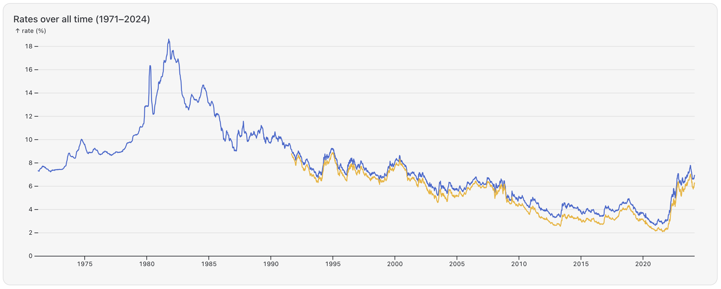
Here is the Plot definition for the line chart above:
Plot.plot({
  width,
  color,
  y: {grid: true, label: "rate (%)"},
  marks: [
    Plot.ruleY([0]),
    Plot.lineY(tidy, {x: "date", y: "rate", stroke: "type", tip: true})
  ]
})
First, we have the width variable to set the chart’s size as well as a color constant, which keeps the color mappings of the 30- and 15-year data series consistent across charts (just width turns into width: width, a little trick to save some typing when your variables already have the obvious names).
Next, we define a vertical axis using the y property, to turn on the grid and add a label at the top of the axis.
Then there are two marks defined here. The first one uses Plot’s ruleY mark, which defines a horizontal line (similar to the tick mark we use below, but when its length isn’t specified it fills the entire width of the chart) to add a horizontal line at y=0 to make the chart look nicer and force Plot to include 0 on the vertical axis.
The second mark draws the actual line of mortgage rate values. Here it is again:
Plot.lineY(tidy, {x: "date", y: "rate", stroke: "type", tip: true})It uses another line-related mark, lineY, which is used to draw line charts. Both line charts use the tidy variable we created earlier, where each row or object has values for the date, rate, and type (30- or 15-year mortgage). These are mapped directly to mark properties here, with the date going to x, rate to y, and the type to stroke. Since there are two types, Plot creates two lines and assigns colors to them based on the color property we defined earlier. Finally, the tip property turns on the default tooltip.
Typical line charts like this one draw lines between the points under the assumption that values change continuously. That isn’t true for mortgage data, which only contains one value for each week and we can’t assume that they change linearly over time (like temperatures would). However, since we’re looking at over 50 years and around 2,700 values in this chart, there are enough data points so stepped and regular line charts look virtually the same.
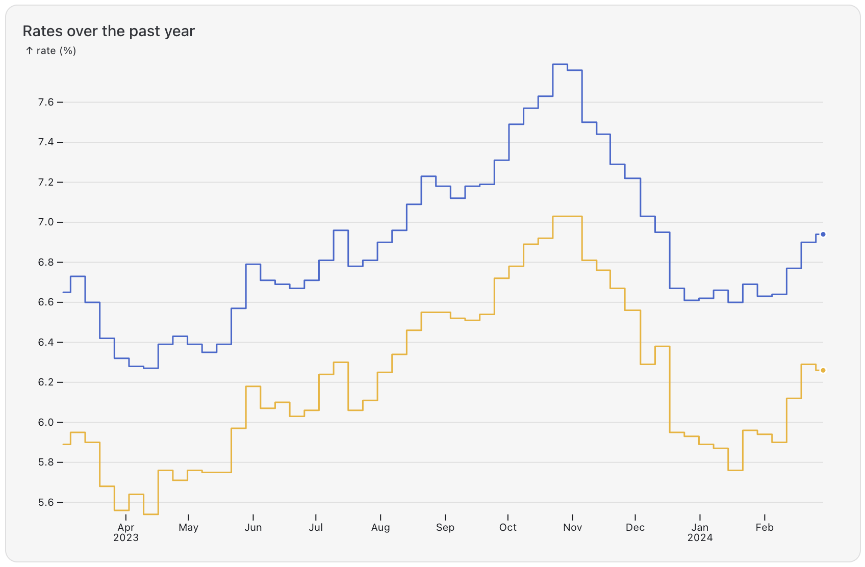
For the top line chart that just shows 52 weeks, however, it is important to make it clear that these are the only values we have in that period. We can do that by creating a stepped line chart that draws horizontal lines between the points in time when the data changes, and then jumps vertically to the next value.
In Plot, this is a simple option. The only thing that changes from the other line chart is the mark definition:
Plot.lineY(tidy.slice(-53 * 2), {
  x: "date",
  y: "rate",
  stroke: "type",
  curve: "step",
  tip: true,
  markerEnd: true
})
There are two main differences here. First, we only take the most recent values from the tidy variable. Since we have two data series for the two mortgage durations, and we need 53 data points to draw 52 lines between them, that ends up being 53⨉2 values.
The other key difference is the additional option, curve: "step". This creates the stepped line chart.
One other addition is the markerEnd option, which draws a dot at the end of each line to indicate that these are the most recent values we have.
The charts at the bottom of the two smaller cards show the most recent 52 mortgage rate values for each series (30- and 15-year fixed rates) as ticks. This gives a sense of the distribution of the values and if they were they higher or lower on average over this time. The most recent value is shown as a heavier, longer black line.
Like the line charts, the tick charts are created entirely in Observable Plot, including the labels for the range of values on either side. The content of the card is created inside a function that can be called for either the 30- or 15-year mortgage durations. It returns the big number and table at the top of the card, as well as the chart. We’ll focus only on the chart here, but feel free to explore how the other parts are created in a reusable JavaScript component.
Here’s the code for the tick charts. No worries, we’ll break it down in a moment:
Plot.plot({
  width,
  height: 40,
  axis: null,
  x: {inset: 40},
  marks: [
    Plot.tickX(pmms.slice(-52), {
      x: key,
      stroke,
      insetTop: 10,
      insetBottom: 10,
      title: (d) => `${d.date?.toLocaleDateString("en-us")}: ${d[key]}%`,
      tip: {anchor: "bottom"}
    }),
    Plot.tickX(pmms.slice(-1), {x: key, strokeWidth: 2}),
    Plot.text([`${range[0]}%`], {frameAnchor: "left"}),
    Plot.text([`${range[1]}%`], {frameAnchor: "right"})
  ]
})
Let’s first look at the beginning of the code for the chart, which sets up its basic parameters.
Plot.plot({
  width,
  height: 40,
  axis: null,
  x: {inset: 40},
It defines the size of the chart using the width and height fields. The width variable comes from the resize() function mentioned above. Since we don’t need an axis, we set that to null, and define a horizontal inset of 40 pixels to make some room for the text labels on both sides.
The definition of the marks begins with Plot’s tickX mark, which simply adds vertical ticks along a range of values:
  marks: [
    Plot.tickX(pmms.slice(-52), {
We provide its data in the form of the pmms.slice(-52) expression, which gives us the last 52 values of the pmms array. The rates are updated every week, which means we get about one year’s worth of data back from the most recent data value.
Following this, we define the mark’s properties:
      x: key,
      stroke,
      insetTop: 10,
      insetBottom: 10,
      title: (d) => `${d.date?.toLocaleDateString("en-us")}: ${d[key]}%`,
      tip: {anchor: "bottom"}
    })
Going from the bottom to the top, we…
set the
tipandtitleproperties to get a tooltip when we hover over the lines,use
insetBottomandinsetTopto shorten the lines vertically so we can later add a longer line as an overlay,use the
strokevalue is defined earlier in the function to select a color that matches the global 15-year or 30-year data series colors used on all the other charts.
Finally, the x property is set to a variable key, which is created earlier in the function:
const key = `pmms${y}`;The y value is passed into the function as a parameter and is either 15 or 30 for the respective duration of the mortgage. Appending that number to the pmms string gives is the name of the field in the pmms data array (e.g. “pmms15”), which Plot uses to access the values.
That wraps up the short ticks that make up the majority of the chart. Next, we add the heavier tick for the most recent value:
Plot.tickX(pmms.slice(-1), {x: key, strokeWidth: 2}),The slice() function here gives us only the last entry in the array. The definition for x is the same as above, and then we only set the strokeWidth to get a heavier line. Since there’s no inset here, the line spans the entire height of the chart, making it more prominent. Marks are rendered in the order in which they are defined in Plot, so this line gets drawn on top of the other ones.
Finally, we add the two text labels on either side of the ticks using Plot’s text mark:
Plot.text([`${range[0]}%`], {frameAnchor: "left"}),
Plot.text([`${range[1]}%`], {frameAnchor: "right"})
The square brackets above create arrays with a single value each as the dataset for Plot. The range variable is created earlier in the function using d3.extent() to get the extreme values of the data range. The frameAnchor property pushes the labels to the left or right, respectively.
And voilà, we have created a tick chart!
Creating charts in code, especially using Observable Framework and Observable Plot, gives us a lot of freedom and power. We can create any chart we want, combine different kinds of charts, and build displays that we might not even think of as charts, like the tick charts. While you can build very complex graphics with Observable Plot, they are built from simple definitions and can be broken down into their individual data mappings.
This example uses Plot and doesn’t include interaction (except for the tooltips). There are many ways to make charts interactive, create different types of visuals using D3, etc. We’ll cover more of these in future blog posts.