

Project Analytics
On your workspace homepage, you see cards for each of the projects deployed to your workspace. They show the name of the project and whether it is public or only visible to your team. Clicking on the name of the project takes you to the dashboard.
In addition, each card shows overall viewer stats over the last 60 days in a small chart.
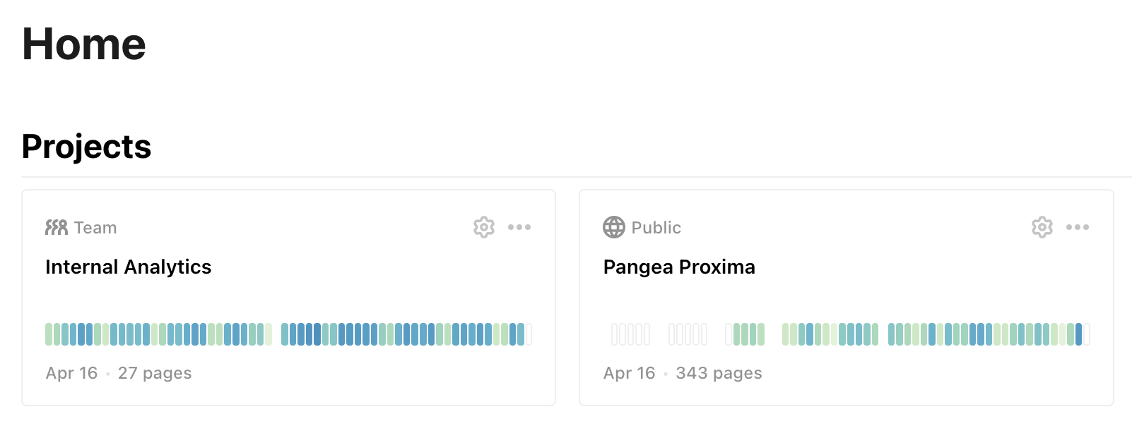
The colors of the bars represent the number of viewers, with darker colors meaning more viewers. Hover over individual bars to see the date the bar represents and the number of viewers on that day.
Individual project analytics pages
Clicking on the chart or the gear symbol in a project card takes you to the project's analytics page. This page breaks out views into individual pages and shows additional information.
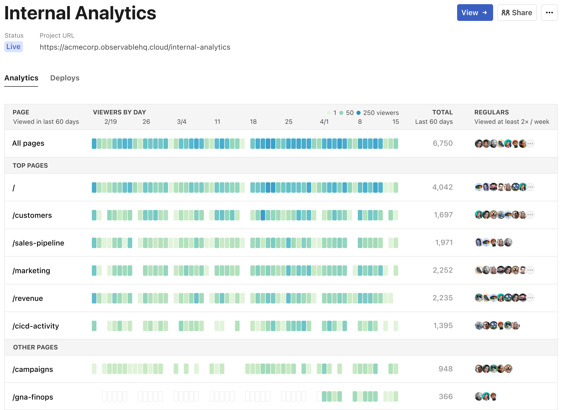
The first row shows the same stats as the card on the project page, but with the addition of a time axes above it, the total number of views, and the list of regulars (see below).
Below it, there is a row for every page in your project, with its own stats. This is grouped into the top pages, which get the most views, and the rest.
Regulars
For team (non-public) projects, the Regulars column shows who has been viewing the dashboard at least twice a week on average. Clicking on the row of avatars opens a floating window that shows more details, including the names and the number of times each workspace member has viewed the page.
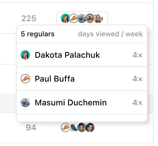
Click anywhere on the page to close the floating window.